
Running a festival isn’t just about putting on a killer show (though y’all sure have that part down!) It’s a year-round process — from pre-event ad campaigns to on-site engagement, there are a ton of moving parts and a ton of data to collect with it. But what good is that data if you’re not learning from it?
That's where a solid year-end report comes in.
Recapping your festival at the end of every season is a surefire way to achieve smarter, more strategic planning year over year. A well-crafted report can help you:
- Identify what worked and what didn’t
- Determine next steps to improve your strategy for next season
- Prove the value of your partners’ investments by laying down the hard numbers, straight-up
Plus, it’s sort of like a data-filled time capsule that you get to look back on, to see how far you’ve come. Who doesn’t love personal growth?!
Whether you’re new to post-event reporting or looking to level up your strategy, follow this checklist — filled with tips and tricks straight from the brains of our Digital Strategy Team — to craft an EOY report that will deliver real value and set you up for even more success next year.
Our reporting checklist:

1. Set your goals

This might seem like a no-brainer, but one of the biggest hurdles our DS team faces with EOY reporting is consolidating the stats and deciding what actually matters. After tracking data for an entire year, there’s a mountain of stats to sift through — and without a clear sense of direction, it’s easy to get lost in the numbers.
The best way to stay on track?
![]() Get aligned from the jump. Set aside some time with key stakeholders ASAP to align on what kind of stats, sections, and format they want to see. This will make sure you hit the mark from the start (and will save you from endless revision loops later on).
Get aligned from the jump. Set aside some time with key stakeholders ASAP to align on what kind of stats, sections, and format they want to see. This will make sure you hit the mark from the start (and will save you from endless revision loops later on).
![]() Build out your blueprint. Map out a clear outline that ties back to those goals. With a little fine-tuning, this can also be used as a template for future reports — a major time-saver when working with multiple partners.
Build out your blueprint. Map out a clear outline that ties back to those goals. With a little fine-tuning, this can also be used as a template for future reports — a major time-saver when working with multiple partners.
2. Dig into the data

Once you’ve laid the groundwork, it’s time to dive into the numbers.
![]() Start with the big picture. We’ve found that the best way to determine what will actually add value is to gather all your data in one place first. Don’t worry if some stats don’t align with the goals you mapped out in your outline – you might even discover a trend that you or your stakeholders were unaware of!
Start with the big picture. We’ve found that the best way to determine what will actually add value is to gather all your data in one place first. Don’t worry if some stats don’t align with the goals you mapped out in your outline – you might even discover a trend that you or your stakeholders were unaware of!
![]() Shave it down to what’s most valuable. You want your final product to be as concise and actionable as possible. If the data doesn’t help you get your message across or offer a meaningful takeaway, it’s likely just creating unnecessary noise. Stick to the stats that make an impact.
Shave it down to what’s most valuable. You want your final product to be as concise and actionable as possible. If the data doesn’t help you get your message across or offer a meaningful takeaway, it’s likely just creating unnecessary noise. Stick to the stats that make an impact.
Not sure what to include? Here are some essentials, according to our DS team:
Fan demographics is a big one. For example, year-over-year reporting of returning fans is up there – who came back and what percentage came back. But arguably, the most important is new fan growth. Things like how you’ve grown your database and who the new fans are. Yes, we want to see more and more people returning each year, but we also want to know that we are constantly growing and expanding.
Conversion rates by ticket type is always important. Specifically, the data on ticket upgrades – like how many GA buyers upgraded to VIP. It’s good to know who and how many of your fans aren’t just coming back but are spending more money on more exclusive experiences. It tells us if our strategies are actually being effective and who to push to for the future.
One of the things our partners look for most is best-performing creatives by milestone (pre-sales, on-sales, etc.), whether it’s images or videos. Which ones were the most engaging, which did people resonate with the most, and which drove the most conversion
Anything that the partner tested out that was unique or different for them, we also like to include. For example, if they ran any artist-specific dark ads (ads that come from the artist’s page rather than from the actual festival page) – looking at how those performed compared to typical strategies.
Looking at ad spend per network is also an important one. We like to use time graphs to showcase the data because the ads are being run for such a long period of time. It makes it easier to see milestones within that period – we can pinpoint where the on-sale was, when there was a price increase or some other big promotion happening, and then also see our return on ad spend over time.
3. Make it digestible

Whether you’re presenting this report to a partner or a higher-up in your own company, there’s always a good chance it will be shared with someone not as closely involved with the project. It’s important to consider how the report will read through their lens: will they be able to contextualize those datapoints and pull out key takeaways at a glance? Or will they take one look at all those vague numbers and give up? (*slams laptop shut*)
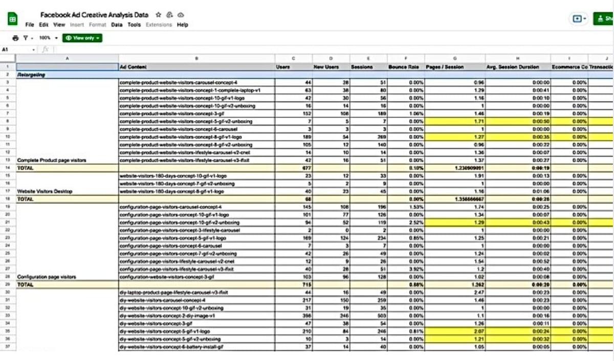
If your current reporting template looks a lot like this:
You might want to try something more like this:


Here's how:
![]() Tell a story with your data. You want to take your audience through a journey of your festival’s success over the season. To do that, lead with the key stats that make an impact, then dive deeper. People don’t want to dig through overly complex info — they want to see the big numbers they can easily recognize and reference. When you hit them with the hard stats, you make a strong first impression, setting the groundwork to then add more context and build out your storyline with actionable insights.
Tell a story with your data. You want to take your audience through a journey of your festival’s success over the season. To do that, lead with the key stats that make an impact, then dive deeper. People don’t want to dig through overly complex info — they want to see the big numbers they can easily recognize and reference. When you hit them with the hard stats, you make a strong first impression, setting the groundwork to then add more context and build out your storyline with actionable insights.
![]() Use engaging visuals to spice things up and keep your audience engaged. Stats are bo-ring on their own – for most people, anyway. Pairing key insights with visual representations – like graphs, pie charts, or screenshots of successful campaigns – wherever possible will make it easier for your stakeholders to visualize performance. Plus, it looks a lot prettier.
Use engaging visuals to spice things up and keep your audience engaged. Stats are bo-ring on their own – for most people, anyway. Pairing key insights with visual representations – like graphs, pie charts, or screenshots of successful campaigns – wherever possible will make it easier for your stakeholders to visualize performance. Plus, it looks a lot prettier.
- Pro tip: Try customizing your report’s appearance by using the festival’s fonts, colour palette, and images! It’ll be sure to impress and help tell that story.
4. Wrap it up with a recap

Just like confetti flying during the last song of the set, end your report with a bang using a strong summary of all important learnings and next steps.
To do so;
![]() Highlight key takeaways you outlined in the report: your biggest wins and any opportunities for improvement. It's important to be transparent about what didn’t go so well, but make sure to keep tone optimistic and solutions-focused.
Highlight key takeaways you outlined in the report: your biggest wins and any opportunities for improvement. It's important to be transparent about what didn’t go so well, but make sure to keep tone optimistic and solutions-focused.
![]() Lay down the roadmap for next season. Close out by providing your recommendations for how to best build on wins and tackle any challenges. You want to leave your stakeholders feeling confident, excited for what’s to come, and at ease knowing they’re in good, data-backed hands.
Lay down the roadmap for next season. Close out by providing your recommendations for how to best build on wins and tackle any challenges. You want to leave your stakeholders feeling confident, excited for what’s to come, and at ease knowing they’re in good, data-backed hands.
And you're all set! Ready to start? Download your checklist here.
Our conclusion
A strong year-end report starts and ends with data-driven insights. It’s your opportunity to confirm what’s working, and might even surprise you with what’s not. More than just a collection of stats, it transforms raw data into clear, immediately actionable takeaways – a tried and true way to get your team aligned for the season ahead.